Letters Are Made of Negotiation: Tobias Frere-Jones on Type Design
"Letters are made of negotiation," says Tobias Frere-Jones, whose typefaces have served Obama, the MTA and Carnegie Hall — a writer who wanted to be a painter, translating brands into shapes.
- AuthorJames Calloway
- ChannelInteraction & Visual Craft
- Filed
- Read5 min
- Tobias Frere-Jones has designed typefaces for clients including the MTA, Carnegie Hall, Obama's 2008 campaign, the ACLU and Stacey Abrams
- In 1992 no design school taught typeface design; Frere-Jones learned on the job at Boston's Font Bureau under David Berlow
- He runs his own typeface foundry in Brooklyn
- He collects children's spelling primers from eras like turn-of-the-century America and 19th-century Germany
- He works in focused blocks of at least 30 minutes to an hour to avoid losing time switching modes
Tobias Frere-Jones answered a friend's question — what are letters made of? — with a single word: negotiation. It's an answer that doubles as a job description for a man whose typefaces have carried Martha Stewart Living, Carnegie Hall, the ACLU, New York City Football Club, Barack Obama's 2008 campaign, Stacey Abrams, the New York City MTA, and Zohran Mamdani's mayoral office. From his own foundry in Brooklyn, Frere-Jones describes himself as a translator, moving constantly between a client's idea of what their brand communicates and his own understanding of what letterforms say to the people reading them.
"The shortest version of my story is that I am a writer who wanted to be a painter," Frere-Jones says. The longer version runs through high school, where he chased drawing, painting, and photography while also writing — his brother, father, and great-grandfather were all writers. He settled on abstract painting and assumed he'd have to abandon the rest. Then, through his father's work in advertising, he stumbled onto typeface design by accident. It was the intersection of abstract expressive form and language he didn't think was possible. "I wasn't even looking for it," he says.
How do you learn a craft nobody teaches?
In 1992, nobody was teaching it. Typeface design was too specialized for most design school curriculums — something Frere-Jones notes has since changed. His first job was as a junior designer at the Font Bureau in Boston, learning on the job the way designers centuries before him had. He soaked up whatever David Berlow, the designer he worked for, would give him, acutely aware of everything he didn't know.
He frames design identity as two schools of thought. One casts designers as engineers solving problems and maximizing results. The other puts them half a step from artists, bringing intuition and expression to their clients. "Both are true," he says. "An important part of my process is to be able to either alternate between these two modes — engineer or artist — or hold them in my head simultaneously so they can collaborate with one another."
Music and history feed that crossover. He plays keyboard and synthesizer and makes sound collages as an amateur, and sees the parallel: Western music has only 12 notes, and everything after that is a variant or a combination — much like typeface design, and like programming. History, particularly the history of his hometown New York, works the same way. The alphabet's shapes carry meaning because we agree they do; the city's streets were developed, handed down, modified, interpreted, and handed down again, resting on the same consensus about how a space works and what it's for.
What does a type designer actually do all day?
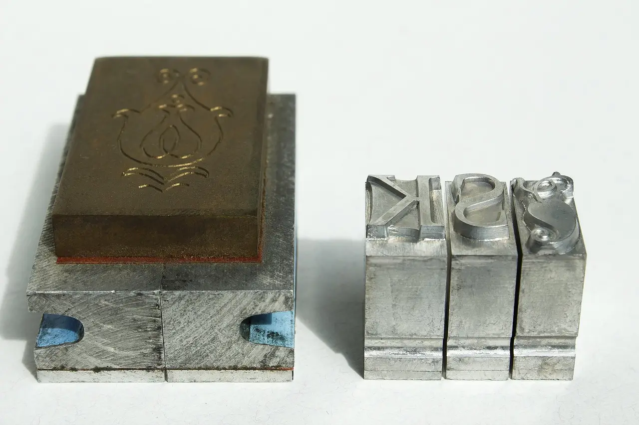
Typeface design has always hugged its delivery technology, whether that was cutting punches for hand casting in the 15th century, machine drawings for automated line casters, or digital fonts now. Frere-Jones can read code and see what it does, but he can't write it.
His working week resists routine. Client conversations, proposals, and pitches shape each day, so he herds interruptions into designated slots and protects the space between for creative work. He checks headlines in the morning, at lunch, and on the way home — conscious, as he puts it, that this little technological marvel of a phone is adept at shredding his concentration. He guards against gear-switching too, staying in a mode for at least half an hour, ideally a full hour, before turning to something else.
When he evaluates young designers, the portfolio matters less than what a conversation reveals. He asks questions he already knows the answers to, watching how candidates answer and what it says about their priorities and thinking — something a résumé can't show.
Why don't clients hear the word "translation"?
He won't describe his translating in those terms to clients. He speaks in whatever language is native to their internal culture, which means different framings for different stakeholders:
- The legal team cares about one thing
- Web developers care about something else
- The CFO cares about something else altogether
Making everyone feel heard, he says, is the basis of a successful project.
He also collects children's spelling primers — the first book a child would have — and finds the drift fascinating. Turn-of-the-century America and 19th-century Germany look weird to us now, but that was their normal. Designers, he argues, need to keep in mind the assumptions baked into forms presented as normal, and the unspoken connection to whatever preceded them.
His clearest solutions arrive when he talks something out, in meandering, unguarded conversation where he sees what he'd missed. Describing a problem in the clearest, most concise way, he says, reliably points to what the solution ought to be.
He compares typography to costume design in film: even when you don't consciously notice what a character wears, the cut and texture of a suit quietly tell you "this guy is the villain." Typography can work in that quiet register, or it can be overt and draw attention to itself.
And the audience keeps sharpening. More people now choose fonts themselves and can watch an Instagram caption change meaning with its formatting. Twenty years of change in the business have left the public more typography-literate than ever — Frere-Jones remembers when explaining his job took real time, and it's been years since he's had to explain it to anybody.
Source: fastcompany.com
More from James Calloway
Show full bio
Senior reporter covering regulation, policy and their impact on Product and interaction design, design systems at Interface Wire.
92 articles