Yoto's new players get a green dial and softer grips, not a bigger screen
Yoto's redesigned players add a green dial with 20 favourites, softer grips and splashproofing — but refuse motion or animation on screen. Heirloom's Jack Godfrey Wood explains the restraint.
- AuthorSophie Lindqvist
- ChannelProduct Design
- Filed
- Read4 min
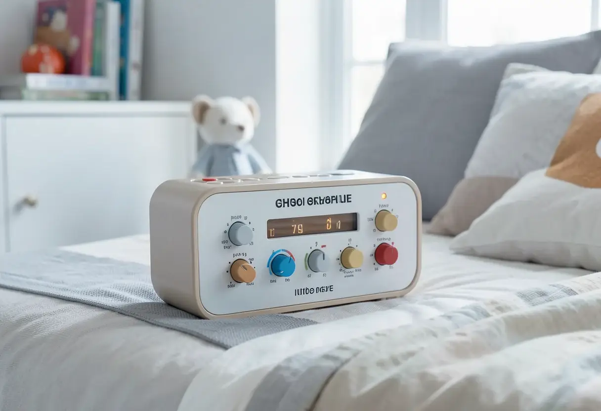
- Heirloom tested 10–15 concepts for one player and 5–6 for the other before finalising the redesign
- The new green dial serves daily radio, podcasts and 20 favourites, with parent-set day and night modes
- Both screens gained resolution but kept a pixel-art style, with no motion or idle animation added
- New players add more storage, more battery, faster downloads and splashproofing
- Yoto's design mission is stated as "kids in control and parents in charge"
Yoto's fifth-generation audio players keep both screens in what the design team calls "pixel world" — higher resolution than before, but no motion, no animation, and no character that waves at a child who has stopped interacting. That restraint is the central decision of the biggest physical redesign in the product's history, and it was deliberate. "We didn't want addictive, distracting moments," said Jack Godfrey Wood of design studio Heirloom, the firm behind the new players. The screens stay deliberately lo-fi: as he put it, "It's a fun menu, not a distracting screen."
The product is a tactile, card-based audio player for children, launched through a Kickstarter-style community campaign and in daily use in households since 2019. Yoto briefed Heirloom with technical and design aims: more storage, more battery, faster downloads, better sound, splashproofing, and a body children could hold, carry and drop without anything breaking.
Who designed it, and why them?
Heirloom's ties to Yoto run deep. One colleague worked on the original Kickstarter version — the wooden cube with two blue dials — and two team members designed later generations at a previous company. The studio also took on the current fourth-generation players. Wood described the appeal plainly: "We all had that Fisher-Price cassette deck as kids and this felt like this generation's version."
What does the green dial do?
The most visible change is a new green dial, a significant move for a community that tracks such details closely. It gives children access to daily radio, podcasts and 20 favourites without them having to manage a library of up to 200 physical cards. The list populates automatically, but parents can configure separate day and night versions in the app: all 20 slots can hold sleep content at night, then switch to music and audiobooks during the day. Favourites also travel with the player, which Wood flagged as useful for holidays. Cards remain central for younger children, he added: "In all our research, they're still the main way younger kids want to use it."
How much on-device content is too much?
Yoto wanted backup content stored on the player itself, so a lost card does not stop playback and a parent does not need to reach for a phone at 9pm. The design constraint was harder than the engineering: deliver that access without turning the screen into an iPod or an iPad. The green dial is the answer — a fixed, parent-managed funnel rather than a browsable library.
The business model shapes the interface. As Wood observed, "Yoto's goal isn't to keep eyeballs on the screen. It's how often the player gets used and whether it adds value to a child's and a family's life." That clarity, he said, made design decisions easier, even as the team produced pixel work he described as "artful, precise and beautiful" while refusing to turn Yoto into another Apple product.
How many concepts were tested?
One of the two players went through 10 to 15 concepts across several areas. When children were handed a more pebbly form, the fit was immediate and obvious, and Heirloom recommended it strongly. The second player took five to six directions, but Yoto wanted continuity with previous generations, so the team concentrated on detailing: dial placement, edge sharpness, grip.
The dials themselves were softened and made slightly longer so children can reach them from multiple angles with more grip. The smart button sits off-centre — a choice most designers would avoid — so a child holding the player from the front can still press it.
How do you design for a vocal community?
Heirloom sits outside Yoto, so community feedback reaches the studio filtered through the Yoto team. The studio does not attempt to fulfil every request; it stays, in Wood's words, "forthright about what we think is right within Yoto's mission." The community also ages up, which creates a dual burden: new families should learn nothing, and existing users should not find that every feature has changed meaning. Wood valued the feedback because "it comes from hard-won experience, not assumptions."
Continuity also lives in small places. There are little faces between the dials, and the charging cable carries four tiny Yoto logos — one of them winking. As Wood put it: "No one's going to talk about it, but one day someone will spot it and get a little flutter of appreciation."
For practitioners, the case is a study in constraint-led design: the screen got sharper and the hardware got tougher, but the interaction model stayed fixed to a mission statement — kids in control, parents in charge. The next test will be whether that balance holds as the community's children grow older and the feature set keeps evolving.
Source: creativebloq.com
More from Sophie Lindqvist
Show full bio
Staff writer covering people, launches and day-to-day practice in Product and interaction design, design systems at Interface Wire.
107 articles